ShopDreamUp AI ArtDreamUp


Description
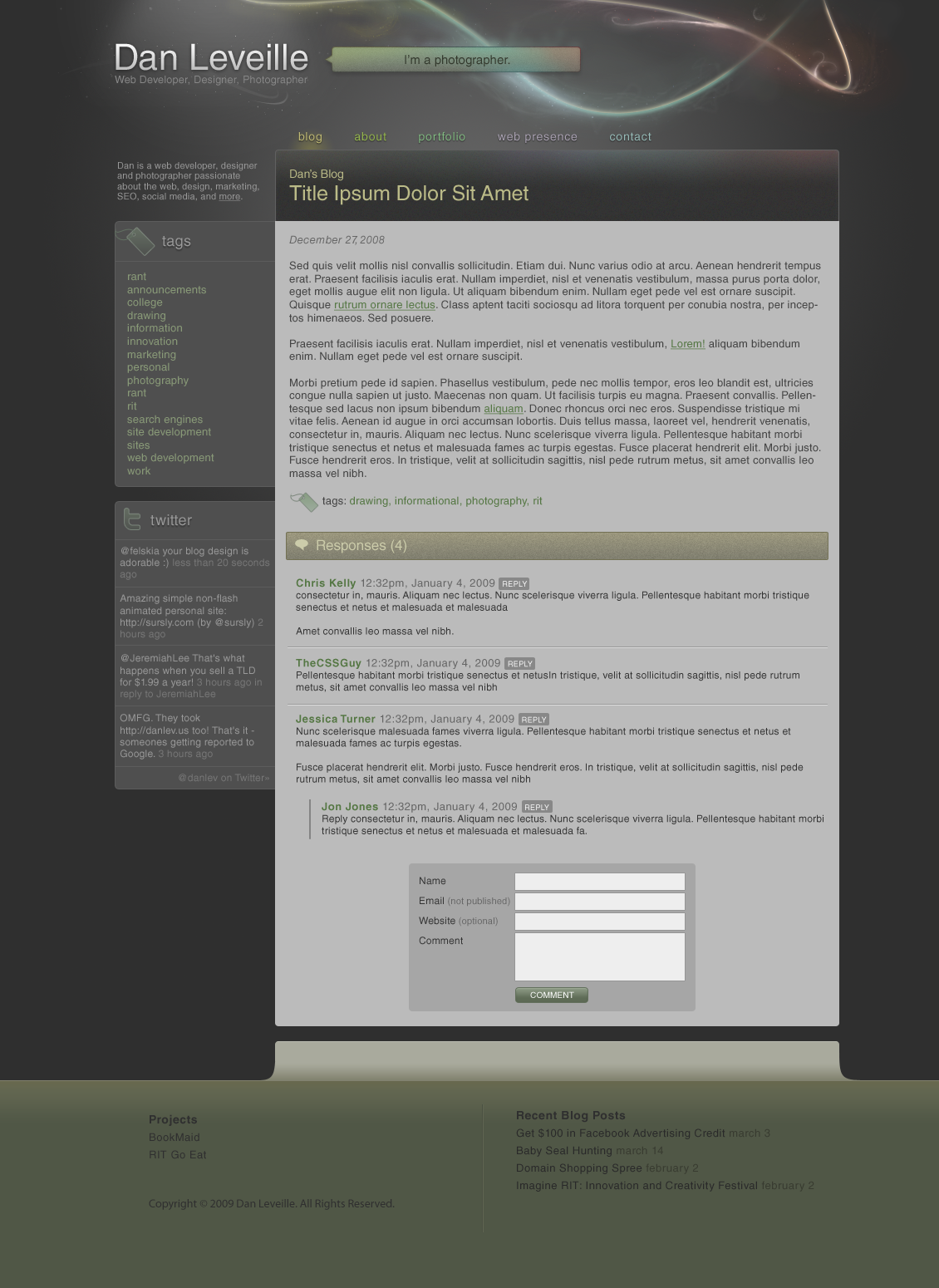
So this is my 9th revision of Version 4 of my website, dan-lev.com, because I'm becoming embarrassed to advertise it's current state.
It's a work in progress - so I'm looking for critiques!
A few notes:
- The "I'm a photographer" will rotate through different sentences describing myself.
- I'm still thinking of something to put in the footer, it's somewhat bare.
- The "swooshes" still need a bit of work. They're a bit rough in some areas.
Image size
1130x1550px 512.81 KB
Created using AI tools
Comments16
Join the community to add your comment. Already a deviant? Log In
First, I would like to mention why I gave it the originality rating that I did; as it is (from what it looks like), it looks like it's made for Wordpress. Wordpress already has over 10,000 themes made for it, commercial or non-commercial. There are themes out there with the light streaks and the dark palish-green theme. However, I haven't ever seen any that include the rainbow in some places that you've put it on the text.
For the impact; even if it isn't that original, it doesn't mean it's good.
It isn't a minimalistic theme, especially compared to what you have running on your website right now. Most people don't have a taste for minimalistic themes, unless it's for just a blog, but you have a gallery and a whole site.
The text isn't huge, like a lot of other themes. It isn't too small either. It's easy going on the eyes, considering you have font smoothing enabled on your computer. When it comes to the links in a post, maybe changing the underline height by one less pixel would make a huge difference. It just seems too big for the rest of the surrounding text.
I kind of find your tag line "I'm a photographer." a bit cheesy. Maybe put a funny quote in there reflecting that you're a photographer. It doesn't even need to be funny. But "I'm a photographer." just seems blunt and straight to the point.
Overall, it's a great Wordpress theme, and even if it's not for Wordpress, it's great eye candy. It's easy going on the eyes. It's dark, but light at the same time; it's not impossible to see. I could be on the site with that theme for hours and not experience any eye strain. All in all, I like it!