In the weekly Site Updates, we've been telling you all about the changes that have been launched to deviantART, getting your feedback, and reporting all the bugs that have been fixed.
This change is a little different, since it involves a feature that has been in place for a long time. We think it deserves an announcement of its own, ahead of time.
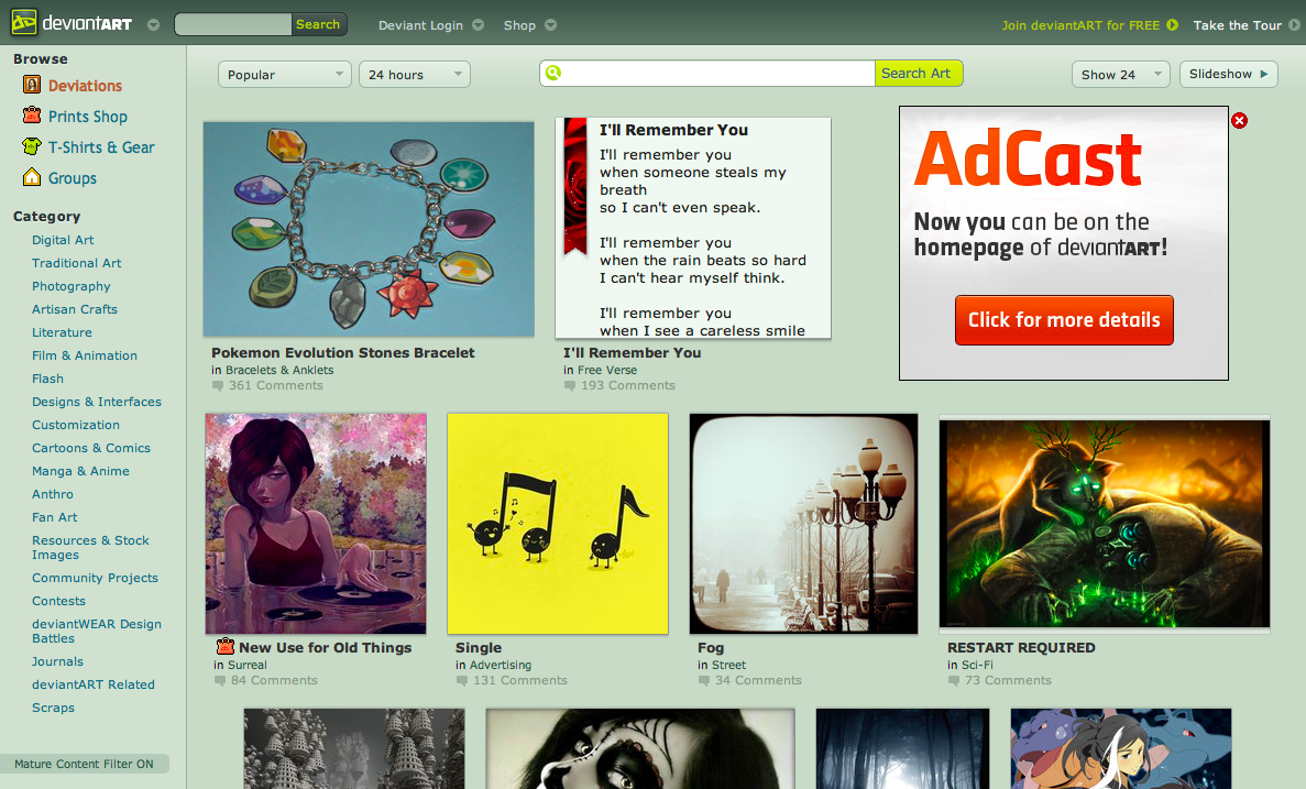
The current deviantART thumbnails (the smaller versions of deviations) have served the community well for years; however, there's always room for improvement.
Some of the problems with existing thumbnails are: they leave a lot of blank space around them, there isn't a lot of room for text for literature deviations, and the thumbnails don't present very tall/wide images well.
Now, we've created a new style of thumbnail, which hopes to solve a lot of these problems.
- We've made all thumbnails bigger!
- We're showing them in tidier rows with no unnecessary cropping.
- For literature thumbnails, we have lightened the background to match the deviation and given it much more room for text.
- For very tall and very wide deviations, we zoom in on the deviation instead of showing a hard-to-click, hard-to-see skinny thumbnail. We wanted to keep cropping to a minimum, but we think this new approach is much better for the artwork.
- We've added a frame around wide, small, and transparent deviations to keep each row tidy.
- The information underneath each thumbnail is aligned to the left for better readability.
- How do you feel about the changes?
- How is your experience browsing art with the new thumbnails?